Call To Action – Get Them To Do Something
When someone lands on your homepage, you’d want them to dig deeper into your content and pages and move them along the funnel. Call to action basically tells them to do something.
Call to action should be placed above the fold (two to three times ideally) and it’ll direct them to take a specific action based on where they are in the buying cycle.
You should never expect your visitors to know what to do next because they simply won’t. You want them to visually see that you gave them a next step to take. If you fail to do this, then you will miss on so many opportunities because people are not patient and won’t try super hard to find what they came for.
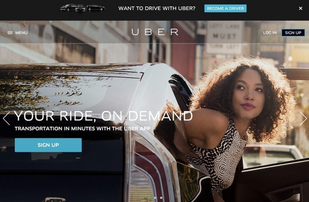
Colour is very important and it should be visually striking and it should contrast the colours of the rest of the website, but of course, still fit within the overall design. Since many people are browsing with mobile these days, you should keep this in mind when optimizing your CTA’s for those users. Don’t make the button too small so they can’t tap it with their finger, and this goes the same for buttons and text.
Call to action text should be brief and to the point and no more than five words. Some good classic examples are “Sign up”, “Try it for free”, etc.
Usually, the more choices you give to somebody, the less likely they are to actually choose something because of the choice paralyses. People will not sit there and think and try to figure out what and where to click. Always avoid making your customer having to think. Always indicate the next action you want them to take, and in the case of the homepage, getting them to read more about your services or maybe checking out a demo might be a good idea. People are not ready to commit after spending a few seconds on your website, so don’t force them.
Try to get in your customer’s mind and think of the questions that might be going through their heads while they are on your homepage and whether they can find what they want quickly.
Make Your Website Mobile Friendly
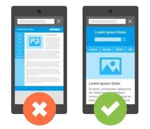
If your website is not mobile friendly yet, then you are far behind everybody else. It is commonplace now to access websites from multiple devices, so it’s critical that you make your website mobile friendly. Not only are websites that are mobile friendly better for SEO (like announced in the update back in 2015), but they provide a much better user experience for everybody, regardless on which device they use. The desktop version of the website is usually difficult to view on mobile devices. Is not an unusual case when someone lands on a website and gets frustrated by this and then immediately hits the back button. Google has stated that volume of search queries on all mobile devices has surpassed desktop.
When you start making your website mobile friendly, you should optimise everything: images, headlines, text copy, etc. If your website is not yet mobile friendly, then you have two options. The first option is to rebuild it in a responsive layout (where your website will automatically adjust to different screen widths) and the second option is to build a dedicated separate mobile website that will specifically be optimised for mobile users.
The main guideline for mobile design is to simplify everything. Your website should be streamlined with very limited information and fewer functions when compared to a desktop version of the website. This is because space is limited on a mobile screen and you need to make the most of it. You can test if your page is mobile friendly with free Google Mobile Friendly Test.
Make It Very Clear What You Do
It is critical to let the visitors know who you are and what you do as soon as they land there. If you are a well-known brand then that might not be the case, but for most websites out there, you’ll have to let know the visitor that they are in the right place.
The headline is probably the most important part here and it should in a single sentence explain what does your company do. Keep it short, clear, and descriptive.
Sub-headline will go under the main headline and here you can define your company or service in more details and the brief description here should answer what problems do you solve for the visitor. Again, keep in mind that you should optimize both headline and sub-headline for mobile, so use larger fonts to give those people a better user experience. Nobody wants to pinch and zoom all the time.
This website for Tebco, clearly lists service offerings and industries serviced for their range of Rock Augers.
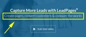
The headline should never be about your stuff. People don’t care about you or your business. The only thing they care about is the solution for their problem. Thus, homepage headline should be about the problem that you solve and not about your company or your products. You can see from the image above how LeadPages does this very well and addresses the issue of people not capturing as many leads as they would like.
Clearly Communicate Your Value Proposition
A very common mistake that most websites are guilty of is that they mainly focus on listing features and don’t describe the actual benefits to the visitor. Benefits will sell to someone, while features will only describe something. The first thing that pops into someone’s head when they visit any website is “What’s in it for me?”. Write the copy on how the visitor will benefit from you and keep in mind that benefits tap into the emotional side and this is something that works. When someone sees your value proposition, they should see why what you do matters to them. Benefits will compel people to buy and stick around.
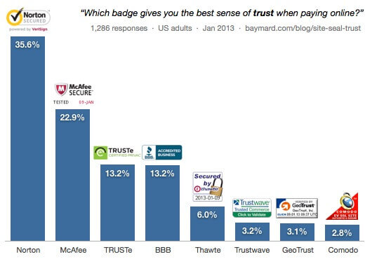
One of the things that you can use to solidify your value proposition is to use some trust indicators. These include things like:
- Customer testimonials
- Success stories
- Case studies
- Professional accreditations
- Media quotes
These things work because people always tend to buy from businesses that they trust, so by showing your visitors that other people also like and trust your business, you can boost your credibility in their eyes. Look for ways to positively associate your business with external parties as this will move people closer to become your customer.
As we mentioned earlier, the entire purpose of the homepage is to get the visitor to take action and move him to another page. Is surprising how many businesses don’t understand this concept and they end up filling up their homepage with useless information that no one cares about. Things like this include huge text about their company, history of the company, people working there, etc. This information has is a place but is not on the homepage.
Less is definitely more when it comes to homepage design and content. Consumers define a good experience by being able to very quickly find exactly what they are looking for. While having this in mind, slamming a bunch of videos, text, and buttons is very confusing for visitors and will put them off. Another example of this that you should avoid is putting company news on the homepage. There is zero reason for you to post that kind of information on the homepage because no one cares besides the people who are working in your company.
Some examples of website homepages that makes good use of special promotions, testimonials or awards to entice customers is CleanandClearWater, suppliers of Water Filters Sydney.
Write Copy With Your Target Audience In Mind
In your copy and headlines, you should clearly state who your product is for. If you’re trying to sell to everybody, then your customer is nobody. Most people on your website will know what they are looking for and if they find something that looks similar to that, they will follow it to read more about it or buy. Thus, having relevant information with the wording your customers would use is critical. If you don’t know the language that your customers use, then simply talk to them and use exact phrases they are using when they talk about your products or a service and then use it on your website.
Buyer personas are a very specific group of customers that you want to market to. You should write your copy having their needs and wants in your mind. People care about themselves and how you can help them, and that’s why buyer personas are very important. This is about knowing who you are selling to, what they are thinking, what are their needs, and what is their situation. Knowing all of these things will put you in a much better position.
What Kind Of Content Should You Include On The Homepage
Online users’ habits are not that much different from customers’ habits in a store. They will glance at each new page, scam some of the text, and then click on the link that catches their attention or resembles something they were looking for. If the new page doesn’t meet their expectations, they will hit the back button and continue searching.
People are conditioned to expect to find what they need in a matter of seconds and they are becoming more and more demanding. You have just a split second to convince users to stay on your website and how you choose to structure the homepage will affect that decision. There are two main parts of the homepage: above the fold and below the fold.
Above The Fold Content
Above the fold content is displayed on their screen right away. It is very important to put the right kind of content above the fold because as people scroll down the page, the number of them who will continue to pay attention will drop significantly. You should put all your primary content above the fold, basically the things you want all your visitors to see. The goal here should be to convince people to stay longer and check out what you have to offer.
A headline is one of the most important aspects and it should make it clear to the visitors what your company does exactly. The headline needs to be short and clear and make it obvious to visitors that you are offering the exact solution to their problem.
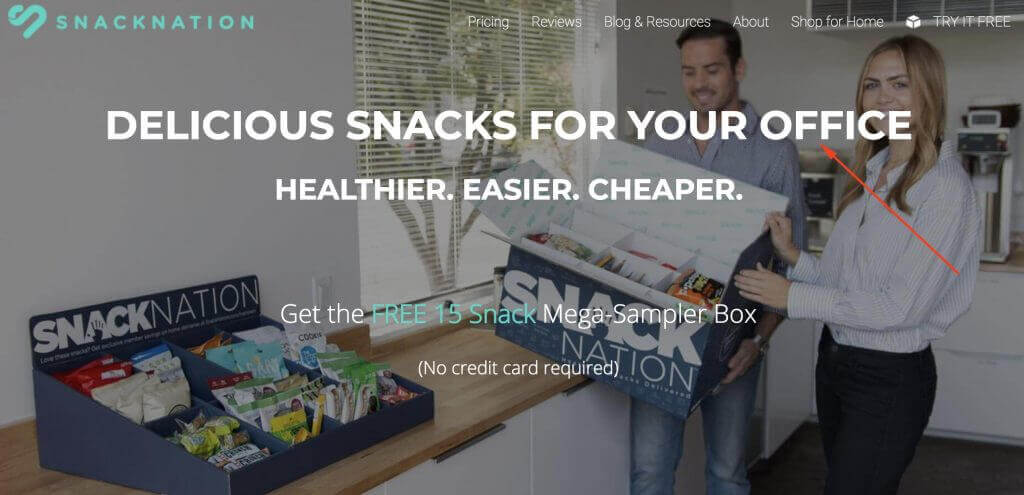
Sub-headline is a good way to define your product or a service in a bit more details. This is a good opportunity to let them know what problems you solve. In the above example, SnackNation provides healthier, easier, and cheaper snacks.
Call to action may be the most important element on the page as it tells the visitors what to do exactly. Most of the visitors won’t know what to do next – you have to tell them! You want them to see that there is the next step so don’t be shy about guiding them. It is important to actively engage with the visitors and tell them what action to take. SnackNation offers a free 15 snack box as a way to get companies to try them out before committing to a monthly recurring contract.
Don’t forget about images and videos because people are drawn to visuals. All of the visuals should be relevant to your website and if they don’t serve any purpose, just don’t use them. A logo is almost always placed above the fold as well.
The navigation bar is a critical element of the homepage as it shows visitors where they can go to get more information they need. Be sure to include only the absolute necessary pages here because there is nothing worse than a bloated navigation. Pages like privacy and copyright are better inserted in the footer. Page titles should be short and descriptive and the location of the navigation bar should be easy to spot.
Below The Fold Content
People that scroll down to see more are generally more interested in what you have to offer otherwise they would hit the back button already. Because of this, below the fold content is created to support above the fold content.
The content here reinforces your primary content and is crucial to convincing visitors to take action. Here, you will educate the visitors and let them know how they will benefit out of your product or service.
One of the most common mistakes is listing features and not focusing on the benefits to customers. People don’t care that much about the features as much as what is in there for them. You should always focus on how your potential customers will benefit from you. Benefits will tap into the emotional side of people while just listing a bunch of features will mean nothing to them. The key here is showing them how you will change their life for the better.
Another thing that you should include are trust indicators. Including customer testimonials, accreditations, media quotes, and social networks links. This is a great way to show visitors that other people like your brand and this can really boost your trustworthiness. Trust indicators are all about associating your business with external parties and they will bring your visitors one step closer to becoming paying customers. People like to follow other people so why not show them that others do business with you?
You should also list some of the features but only after you listed the benefits. Features will let potential customers know what exactly are they getting. Avoid making a mistake of listing a huge list of features that don’t relate to customers too much. Even if some features sound interesting, people won’t care if they don’t solve their problems. Make a short list of features that will resonate with the visitors and remove any extra unnecessary features that won’t have a big impact on your homepage.
Lastly, things like blog articles, event schedules, location map, etc. are nice to have but are not critical in making your homepage effective. That kind of content has a place on the website and it should be placed in the appropriate location. Placing them in the wrong place can easily confuse people and just create huge clutter.
CONCLUSION
When designing your homepage, the goal is not just to make it pretty. It’s about how easy it is for the visitors to see what you do, how you can solve their problem, and how they can benefit from your product. You should never leave it up to people to figure out what to do next, so having a very clear call to action that will lead them to the next step is a must.
Your homepage should constantly change, update, and evolve. You won’t get it perfect on your first attempt, so keep testing different hypotheses and see what layout makes the biggest difference.

