As more and more people move to an “Always On” world, where we are constantly connected to our devices, mobile browsing of websites through devices like Smart phones and Tablets continues to rise. With an increasing percentage of users researching services and purchasing products from Tablets and mobile phones, a key focus of any online business should be to deliver the best possible browsing experience at all times and on all devices. Having a mobile-friendly website is no longer an optional extra, but now a crucial, core ingredient in online marketing strategy and business success.
Enhancing the online experience for mobile
Google’s recent Search Algorithm update was aimed specifically at mobile-friendly websites. The algorithm looks at how mobile-friendly a site is with a focus on displaying high-quality, easy to navigate websites higher up in it’s Search Results. When a consumer searches for a product or service online from their mobile device, Google will show the user the most appropriate website results – those that are mobile-friendly. For website owners looking to be found in Google on mobile devices, a mobile-friendly website is now a crucial consideration. To learn more about Google’s new update, read our related blog article.
What is Responsive Web Design?
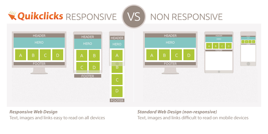
Google rank benefits aside, the core advantage in having a mobile-friendly website is obvious – allow your visitors to easily research your services and buy your products from any device. There are a number of mobile-friendly website development options, but the best by far for may reasons is a method of building a website using Responsive Website Design. Utilising Responsive design ensures your whole website (not just a few key pages) are visible on mobile devices. When viewing a website that is not mobile-friendly on a mobile phone, the user will just see the entire ‘regular-sized’ website shrunk down to fit on the small mobile screen. Text, links, pictures and menu items are therefore all shrunk to minute sizes and extremely difficult to interact with unless a user ‘zooms-in’. Using Responsive webdesign keeps your site and all the content within it fluid and ensures your website fits any device available now or in released in the future – this is because the website is developed to grow and shrink dynamically as the browser window size changes for different devices. The content on each page dynamically re-organises it self and stacks to fit the space available on the device being used, while keeping the actual text, links and image content at optimal viewing size so that no manual ‘zooming’ is required by the user.
At Quikclicks we design and build beautiful, fast, clean responsive websites that are optimised for all devices and across all platforms. We custom build your website to not only your business needs but to the needs of your clients or customers. We have extensive experience in Responsive Ecommerce Website Design and can help you maximise your online business opportunities.
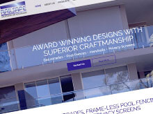
Responsive websites recently built by Quikclicks
Below are some recent Responsive sites built by Quikclicks. View more examples of our recent Web Design work on our Web Design Portfolio