8 Amazing Web Design Trends To Try In 2019 [Updated Edition]

A good design can really make or break your website experience. Your website is the face of your company and it is crucial to keep it up with the trends. In the world of innovation, people love trendy things. To get the best results out of your web design efforts, it is important to incorporate the latest design trends to make it appear fresh.

Web design is really subject to shifts in technology than its traditional print counterparts. Web designers have somehow managed to cope with increased technical challenges and still manage to design websites that are innovative, clear, beautiful and able to adapt to every device.

This year has truly been a remarkable year for web design. With each new year there are new web design trends we see across websites. Web design trends are constantly changing, evolving, and innovating. Last year was all about micro interactions and web animations, chatbots, and design prints while 2018 has been a year of new practices, trends, and standards. Trends like brutalism are still growing.

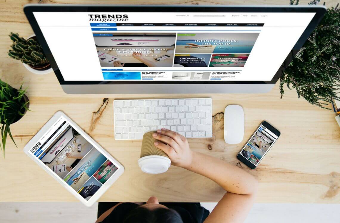
It may be the perfect time to finally redesign your website if you’ve been postponing it for a long time! For example, websites that are responsive but not mobile-friendly are likely several years old and may need an update. It is really crucial to follow what is happening with web design and what will continue into the next year.

As your business is evolving, you more likely have better imagery, better messaging, and a better brand overall so you’d want your website to reflect that. When potential customers are visiting your website for the first time, they want to see the best representation of your business. If they see a website with out-of-date or broken elements, it may give them a bad impression and you may lose a potential business opportunity.

As we are getting close to the end of a year, we can see websites implementing the following web designs in practice. It is really a great opportunity to update your site with a new trendy look!

(Related reading: Collaborate with designers and developers to boost creativity and production)

Animations And Interactions

The web is not a static medium and it allows for much more than just words on a page. Also, as technology advances, more and more websites are moving from static images and using animations to engage users in their communication approach.

People rely on visual cues to get as much information as possible. The attention span has taken a nosedive so in order to keep visitors engaged, you really need to present them the information in a way that is more innovative and engaging than text or an image.

Animation can really make ideas easier to understand. People are constantly in a hurry and their time is short, so in that case, animation can convey complex ideas in a short amount of time while at the same time being engaging.

There are several different ways and places where you can use animations to make your content more engaging and explanatory such as the homepage banner. However, there are other subtler ways how you can use animations such as implementing them at places where there is a waiting period such as the moment when a user has submitted a form or when the page is loading. This is a good way to keep the user engaged and preventing them from leaving.

The volume of creation tools that are available to designers has played a big role in making animations this popular. So, when you combine the availability of these tools with constant browser improvements, it’s clear why animations are big in 2018.

It is important not to include animation just for the sake of including it. It has to be right for your website and you must choose when and when not to use it. Think, does it enhance your message and adds to the positive experience? But in the end, when it’s done well, animation can easily transform a good website into a great one.

There’s also a movement towards more user-focused animations called microinteractions. They originate from mobile apps and has made their move onto the web. Microinteractions work like animated responses to user behaviours. For example, when someone clicks a button, the animation would respond accordingly. These animations can come in the form of fading effects, bouncing effects, changes in depth of the page, and much more.

JavaScript and CSS3 offer easy control over microinteractions so it’s all about finding the right library for you. You can also check out Anime.js which is a powerful library that can be used for any type of microinteraction development.

Vibrant And Bold Colours

You can see across the web that designers are slowly moving away from a safe colour palette that was used in the past years and adapting colour schemes that are bold and vivid. This year has certainly been the year of super excess colours. This was partly helped by tech advances in monitors and displays that have the ability to reproduce rich colours.

Smart selection of vibrant colour tones, your company can set a branded tone to its web project. No matter what colour scheme you go for, the main rule is that a website should feature no more than 3 main colours. Sometimes, companies ignore this and make their website colourful like a rainbow which can have a negative effect on the visitor’s perception of a web page in general. An example that does this well, is this website for Live Reiki a provider of Reiki classes and coaching in Australia – only a few strong colours are used.

When doing rebranding update, you may opt for bold colours in combination with pastel hues. This will have a clean look and it’ll be easy on the eyes. Don’t forget to use neutral colours in the background to provide better readability of the content.

Gradients have been popular in the past years and that trend has continued into this year. Designers have been moving away from the minimal design and started adopting dynamic expressiveness of gradients. Adding some colour is an easy way to create a striking design and this year we’ve seen the usage of less contrast and the use of natural gradients. Natural gradients between two colours provide an easy view and creates sort of a movement on a page which naturally guides a users’ eye.

­Innovative Typography And Fonts

Typography has always been a staple visual tool in web design. Designers should be careful while choosing the right font, size, and typeface because it is really crucial to the website design.  The exact typography will help you express the message that you want to convey to your users. Your font size should be big enough because it’ll better utilise the white spaces.

Variable fonts are one of the most popular web design trends this year. This is where you use fonts that vary in height, styles, and width. It is also advisable to be careful about this and playing with different types of typography as it is easy to make it impossible to differentiate words on the page. When you use different weights and widths, the creative effect will give the audience a more interactive browsing experience.

Because screen resolutions are getting better and sharper, designers are starting to use custom fonts more frequently. There’s another trend – typography cutouts. This technique uses a block of colour over an image that appears through clear lettering.

You should try intertwined typography if you are looking for a more 3D look. This trend layers various elements of the graphics and text to pull out specific details and trick the eye into seeing it like it’s realistic. There are many ways that you can implement this look into your website and add an extra dimension to your design.

The font that you use for your company can really define its personality. Fonts are as important as any other element on your website because they help to get attention and create visual identity. One of the huge trends this year is big and bold typography. Big typefaces are pleasing and have an impact on reading comprehension, reading speed, and user perception.

Oversized typefaces show that this year is not about subtlety and that this trend will continue to develop. Big typography is a great way to get important messages across to your audience and they look good when used as headers. Usability is also important so try to strike a balance between fonts that look good and are still readable.

While the importance of fonts isn’t anything new, this year is truly the year of typography. As new design techniques have developed, designers now have a lot more freedom to play with better and bigger typography.  There is a range of new possibilities to work with but it’s still important to find the right balance between the background and foreground fonts.

Artificial Intelligence

AI (artificial intelligence) has worked its way into mainstream web design in 2018, mainly through chatbots (conversational interfaces). You are probably already using an AI in your day-to-day life without even knowing it. AI also powers voice assistants like Siri and Google Home, smart home devices, self-driving cars, and more.

It’s really not a rare thing to see a brand implementing AI into their web projects because you need to remain always online in order to keep the clients or customers with you. That is the main reason why businesses massively started using chatbots as a good alternative to the real-time communication.

AI and chatbots can really take the customer care to the next level. Most common chatbots respond only to specific questions and commands but when paired with AI, it can simulate a realistic conversation. It does this by learning new bits of information from each interaction and then it adapts the response and actions accordingly.

The AI technology is quickly gaining momentum where the concept of it is shaping our digital interactions. AI virtual assistants can simplify web development. They can ask a question and then based on the content of the answer, AI virtual assistant can create personalised content with the exact combination of brand, layout, design, and content required by the user. For example, Adobe Sense automatically analysis the entries and recommends design elements to the user. These ranges from the creation of elements in images or automatic basic photo editing like trimming.

One of the problems in web design are inconsistencies. Sometimes they are too small to be recognised by the designer but they can end up affecting the user experience in a bad way. On the other hand, machines are effective in spotting inconsistencies and also fixing them whether it’s a computer graphic or a web design. For example, there is an image on a website but something is displaced. AI can instantly detect that, flag the issue, and fix it with a combination of machine learning and context apprehension ability.

AI can also help with personalising content whether it’s blogs, videos, or articles. By implementing AI on the website, you can show users certain content that is tailored to them. AI can suggest new blogs or videos for users based on their past behaviour.


Unconventional Grid Layouts

Back in the days, web designers have opted for a more structured look of symmetrical grids and clean straight lines. Broken layouts have actually been introduced back in 2017 but this web design trend is still popular in 2018. The main appeal of this type of layout is that it’s unique and distinctive. It is a really good way to set your brand apart.

The broken layout works well for a design that is not heavy on text and features more images (because the text is always best viewed in a well-structured layout). In this technique, the images and text begin to overlap, creating unexpected beautiful combinations.

Web design is no longer constraint to rigid layouts and the number of unconventional layouts are trending across the web. They are distinctive and unique but in order to successfully design a website with this kind of a layout, you have to strike a good balance of different design elements to help the user draw eyes across the page.

Asymmetry can be tricky to use and that is the reason why some web designers stay away from it. You don’t have to though because using asymmetry is something every designer can do; it just takes a little planning. You can achieve balance by pairing up elements that are dissimilar, e.g. putting text and images next to each other. The elements that are positioned next to each other should be somehow related otherwise the layout will feel artificial. You should also watch negative and positive space. This is because balancing those out in different sections of the page will help maintain a sense of balance.

You can also use asymmetry in the minimalism design. With so much space being used, it is easy to balance a simple image or object against a large white or dark background. The balancing act between the elements and white or negative space will create contrast and it will direct the movement of the eye across the design.

Floating Navigation Menus

One of the most established elements of web design has been the navigation menu at the top of the website, however web designers have been playing with the navigation menu positions and one of the most used techniques this year has been the floating navigation menu.

Fixed navigation has been a go-to menu option for sites that are conversion focused because the call to action sticks with the user as they scroll. But this year, designers have been taking this idea a step further and detaching the navigation from the rest of the design and moving it below the top of a browser window. The way to achieve this is to simply add a drop of shadow to the navigation bar and move it a bit below the top of the site.

Making The Most Of Mobile

It is known that mobile browsing has surpassed desktop. Most people shop and orders things on their smartphone. This trend doesn’t seem to be going in any other direction anytime soon. Because of that, it is critical that web design follows this trend and makes new ways to render seamlessly on mobile devices of all screen sizes and resolutions. This means the introduction of innovative layouts, smart navigation styles and UX-focused design that can bring a lot of information on a small smartphone screen.

The most important trend in mobile design is a time-saving design. When people use their smartphone, they want to get something done right away. Users want to use websites that help them reach their goal as fast as possible.

Smartphones have a lot of built-in sensors like location tracking, touch sensor, accelerometer, and the camera and web designers can leverage all of them to improve the user experience. One of the examples is biometric authentication which can minimise the number of steps required to use an app and bypass the traditional password. Research shows that most users prefer biometric sign-ins anyway (89% of Apple users use Touch ID).

In a nutshell, making the most out of mobile is all about figure out how users are consuming information on mobile devices. You can achieve this by concentrating on not only making pages dynamically responsive but also making them clearer. Animations, rollovers, and hover states are what brings websites to life. You need to add support for touch gestures because a static page won’t be as engaging as something that is more dynamic.

You also need to forget about using carousels on mobile. Data from Google has shown that less than one percent of mobile users engage with carousels so don’t hide important content behind it.

The experience on mobile shouldn’t be an exact replica of the desktop experience. Feel free to reduce certain features and content in order to accommodate the user’s screen size. Consistency is one of the key pillars of user experience best practices. It is recommended to keep a consistent library of UX assets across all devices, screens, and resolutions.

Don’t forget that you can use real user tests to see if a design actually works. This was you will make decisions based on fact rather than preference. Plus, real user data is very powerful when being challenged by the subjective taste of a client.

You should also not forget the basics. Make sure that a website has an up-to-date SSL certificate, lightweight SVG sprite sheet, and fast loading speeds as this will improve the user experience.

You should also make sure that users have a seamless cross-channel experience. This is because using a mobile app or a website is not an isolated experience. Users should always be able to switch to a different medium and continue where they left off. 37% of online shoppers tend to do research on mobile phones but then switch to the desktop computer to complete a purchase.

The release of the iPhone X introduced some changes about how people interact with a mobile device. The phone lacks a physical home button so all of the interactions with it are gesture-based. For a designer, this means that users are ready to adopt gesture-only interfaces and buttonless UIs are a big step towards interface that will rely only on gestures or voice.

Moving Away From The Homepage

New websites from forward-thinking brands are moving away from a traditional homepage and towards more dynamic user entry points. Users can expect a more personalised experience when they visit a website based on their location, history, and other data.

As mobile apps and social profiles continue to evolve, the website as a business brochure is also changing. Websites are becoming hubs for different pieces of information and there is real innovation happening on how this information is organised. We are seeing that websites are becoming just one part of a representation of a business message. Web designers should start looking at the website as one part of a cross-device experience.

CONCLUSION

There are even more web design trends that are popular that we didn’t emphasize – flat design, minimalism, layouts with negative space, biometric authentication, and many more. We covered some of the newer techniques that you should really consider.

Implementing some of these ideas can bring a new vibe to your website. Web designers have to see the bigger picture and make a decision on what kind of techniques to apply and take inspiration from.