EASE OF USE
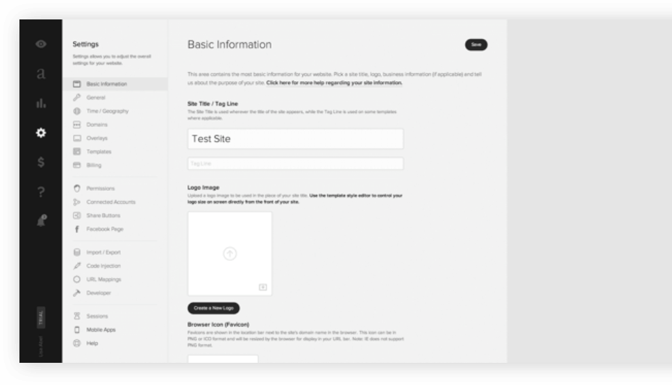
Squarespace features a very elegant editing interface but it is not the most intuitive you can find around. It can also be disorienting for some users to see that there is no sidebar for adding elements. Instead of the sidebar, Squarespace opens a dialog box of content items when you click somewhere to add a new element. Once you hover your mouse over a content block, it’ll give you the option to add or edit elements. Editing takes place in full-screen view and you just need to tap the edit button to start editing.
Page layouts for pages like About us, Contact, and Team look pretty good out of the box and you usually won’t need to edit the layout at all. There’s plenty of page elements to choose from, including text, spacers, images, buttons, galleries, charts, links, and forms. The downside here is that you are not able to place things exactly where you want on the page. You’ll need to get proficient at using the spacer element in order to position rest of the elements where you want them.
Adding pages is really easy. You just need to click on the side menu panel and it’ll give you several options like a blank page, cover page, blog, album, folder, events, link, gallery, and products. You can then move pages up and down in the navigation and also create folders if you want to create nested navigation.
Squarespace offers dozens of templates that look really sharp and professional. The downside to this is that there are limitations with design due to the nature of how the platform is built. Since Squarespace is a framework only, it’ll offer limited customisation options even with custom CSS code. If you are looking to really customise all the little details to your liking, you will hit a point where you cannot do it any further.


