

The Anatomy of Designing Hero Images
- Facebook54
- 54shares
Designing Hero Images
The first impression is important, and a great way to do so is with a good hero image that complements your value proposition. Hero images are one of the most popular trends in web design nowadays. Visitors feel pleased when they land on a website that makes sense and one that is clear, easy to read, and understandable. People will make a judgement in a few seconds, and hero image will help introduce ease of consumption and clarity.
They are generally defined as the main and first photo or graphic that someone sees at the top of a website. The main goal of the hero image is to draw visitors in and give them a clear idea on what your website and content are all about. Most people think of hero images as a form of introduction because it will give them an idea of what they can expect when they browse your website further.
Hero image will engage the user and draw him in while providing a perfect centrepiece for minimalist websites. The usage of hero images can enhance the design of a website while also adding depth to the content. If you have a fun and colourful hero image, visitors will expect some playfulness, or if you had a sophisticated hero image, they will expect culture and class.
The top section of the homepage is sometimes used to host sliders. Sliders are popular but are usually bad for website conversions. Visitors tend to get confused because sliders remove the focus that a page needs to have. By the time someone sees 4 or 5 sliders, their focus is lost. Unlike sliders, effective hero section will make use of non-moving elements and it will drive home a central point and a single message.
Hero Images Trends
Hero images come in different shapes and sizes, from featured content to full-screen banners to large headers. As websites have progressed from only HTML to CSS, JavaScript, and Flash, web designers have utilised these technologies to make things more visual.
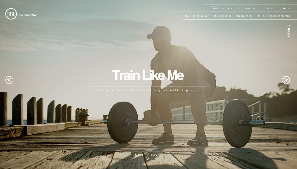
The main trend may be summarised as large headers and they are the bread and butter of hero images. A hero header is an oversized display with text, navigation, and visual elements above the scroll. The elements on top of it can be stacked and layered in any shape or form, but the most common one is to use a photo with text and element overlays. For a hero header image, you’d want to use something that is distinct and stands out. Images are very important part of a hero header, and the right one can draw the visitor into your website.
The majority of hero images are photographs that relate to the content and website. Over time, designers started to implement illustrated artwork, vector backgrounds, and even animated video. Photograph still remains the most popular as it is relatable and descriptive.
Have anything to add? Let us know in the comments.
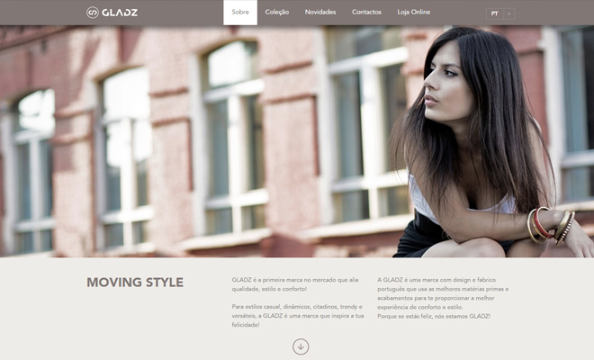
Hero images are popular in single page designers and most of these parallax websites and landing pages only have a small amount of information available. Well thought out aesthetics can offer space between the content and add value to the page like in the website above. It has a full screen background and a fixed navigation bar.
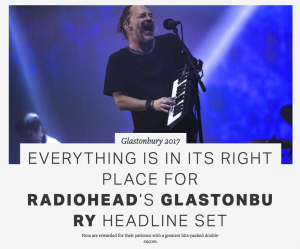
There are many online blogs and magazines online now and since WordPress introduced their featured images, there have been many magazine themes created since then. Besides the homepage, magazine themes have the hero image on each article as well as a way to draw attention to that article. It is also a great method to draw people further into the blog.
Use A Beautiful High-Quality Image
This may not need to be said, but make sure that your image looks sharp and not pixelated and blurry. Computer and even phone screens are big and crisp now and it will be obvious to your visitors if you are using a low-resolution and fuzzy image. Images should never be resized up, but only down. With hero images, images are everything as you’re trying to achieve a good first impression.
Regarding the image width and height, the size of your hero image will depend on what you’re trying to achieve. If you plan to have your hero image take up the full width of the page, make sure that the image is 100% of the container tag through VH or VW).
Make sure that the background is not too loud in the places where you want to have text and look for a good colour contrast.
Keep an Eye On Loading Times
Hero image is an important design element, so it should render very quickly. This is something to keep in mind especially with large, high-quality images. Research from Google has shown that traffic can drop by 20% if a loading time increases from only 0.4 to 0.9 seconds.
Here are some of the best practices to keep the loading time low:
- Compress the image in Photoshop or some online compressing tool
- Resize the image yourself (instead of having the browser resize it automatically)
- Test different file types such as .jpg and .png to see which one will give you good quality without sacrificing load times
- Use page caching to your advantage
Design with Different Screen Sizes in Mind
Nowadays, there are so many different screen sizes, so you absolutely have to make sure that your hero image is sized appropriately across platforms. No matter on which device someone browses, they should see a perfect sized image. Even for small devices, you should resize or swap out a large image for a smaller one. It is obvious that using one image for all devices and screen resolutions isn’t enough.
Manipulating and delivering media such as images on responsive websites has become one of the main challenges that developers face.
Highlight Call to Action
The hero image should mostly serve as the centrepiece that displays one important information. It should immediately make the visitor stop but without saying everything. One important element of the hero image is a call to action.
Make sure that call to action is not competing with the actual image and you can use colour to your advantage in order to emphasize what you want user to do.
There is a simple test that you can use to see if your call to action is visible enough. You can use a simple blur effect to test visual hierarchy and check if the visitor’s eye would go toward the call to action. To do this, simply screenshot your website and apply object blur effect in Adobe Photoshop. Then you just need to look at which element stands out.
The purpose of the hero image is usually an interaction between the visitor and company. To reach a goal of turning them into a loyal visitor or a lead, you need to get them to take certain action. When designing a CTA, make sure that it is one of the first things people notice (like we mentioned above with a contrast and blur test). You also want your CTA to be persuasive and that what follows after someone clicks on the CTA is worth it.
Stop Using Stock Images
Visitors don’t like stock images that much as they don’t have any realness and personality. Real people will engage users much better because when they see people’s faces, they will feel connected with them. Tests have shown that using stock images just for a decorative purpose rarely adds value and does more harm than good.
The best way is to use photographs of people who match your website’s character and who would well represent your product. Hero images that have a single main subject work much better than using crowd shots.
Make Hero Image Relevant
If your hero image doesn’t accurately portray the website’s content, then it provides no value. Having a non-relevant hero image can also cause confusion and users will end up leaving. The hero image should give a sense of what to expect from your website.
To find relevancy, you should ask yourself what is the main value that your product or service offer and what kind of image would reflect that value. It will come down to what your visitors would like to see and how easily they can understand it. People are visual creatures and that is why you should give them a highly relevant hero image.
Here are some of the most common styles that hero images base themselves on:
- Action: image shows a certain action that is clearly linked to what your website is about
- Product: showcase your product as an image
- Emotion: image uses emotional triggers (people smiling)
- Context: image tells a story
Choose one of these styles and pick an image that tells the message in the most creative way possible. Remember, the more company related your image is, the better. This is why it is recommended to make your own images instead of using stock images.
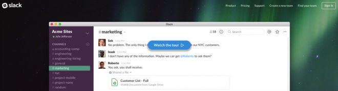
It is good to be picky with the photo and it should fit the purpose of the website. For example, if your website is selling a product, a good use of the hero image would be to show off that product’s benefits. Contextual hero images work great for products as they don’t show only how that product looks, but also how it works in a real situation. This also applies to services and digital products. You can just take a screenshot of the application so people can see what they can expect. A good example of this is Slack on the image below:
Find The Right Contrast
The hero image will in most cases contain the image, the content, and the call to action. Each of those plays an important role and this is why you need to create a balance with the use of colours. Adding a gradient overlay or colour to the image is usually sufficient.
It is really hard to make text stand out when you place in on top of a fullscreen image, but there are some tricks that you can use to increase the contrast between the two. The typefaces that you use on top of the image are very important. They should be easy to read and fit perfectly with the visuals but also stand out. Just make sure that if you place text over the image, that the main part of the image is understandable and visible.
You can try to add text contrast is in the form of a scrim. This is a visual aid that softens and image and, by doing that, the overlaid text will become more readable. Another thing that you can implement is to use your brand’s colours to even further enhance the hero image. Most brands have some specific colours associated with them, so you just need to identify it and apply it to your image.
Use Photos Appropriately
Hero images generally work best on specific pages like homepage, landing page, product page, and blog posts. Other examples include personal info for a bio page or long form content. Using a hero image on every page of the website will lead to losing its effect in most cases. Take each page with consideration of its needs and learn where her images can fit best.
A good example would be restaurants. They look great when hero image showcases their food, location, and ambience.

CONCLUSION
Hero headers are among the most popular and best trends in web design today. A great thing about this technique is that it works with practically any website. When done correctly, hero images will complement a value proposition and increase the clarity on a page.
Designing hero images is all about placement and relevance. Whether you are an experienced photographer and designer or not, UI design skills will make a huge difference with hero image placement. There are also many ways how you can use a hero image, so it is important to test. Take the best practices that we mentioned here and see what works best for your website.
- Facebook54
- 54shares