9 Tweaks To Your eCom Website To Help You Skyrocket Conversion Rates

Q: HOW IMPORTANT IS DESIGN FOR AN ECOMMERCE STORE’S CONVERSION RATES?

Good design encourages customers to buy. This means eCommerce store owners can increase the conversion rates from page visits to sales without ramping up their marketing budget.

If you’re looking for ways to improve the design and conversion rates of your eCommerce store, you’ve come to the right place. In this article, we’ll provide you with 9 simple tweaks that will help you to skyrocket conversion rates, and increase your revenue exponentially.

#1 TRUST DRIVERS

Trust drivers increase the perceived trustworthiness of your site.

By incorporating trust drivers into your eCommerce store, you’ll reduce the friction associated with a purchase, and subtly nudge your shoppers towards making a purchase, converting them from simple visitor to customer.

use trust drivers to improve conversion rates

Take the storefront which we designed for boutique tea purveyor Blossom Blends for example. This features the logos of various press and publications that Blossom Blends has appeared in (demonstrating trustworthiness!), as well as a SecurePay trust badge.

Apart from using these trust drivers on your homepage, you should also be using them (liberally!) in your cart page.

When it comes to trust drivers and using them to increase conversion rates more is more, so go ahead and add all the logos of your payment providers (Visa, Mastercard, Paypal etc) to your cart page to put your customers’ minds at ease. Include security seals which will show your customers that your website is free of malicious code and phishing scams. These can be obtained from your SSL vendors – Symantec, Comodo, and GeoTrust, for example. These will give you a code which you can easily copy and paste on your website.

#2: OPTIMIZE YOUR CALL TO ACTION COLOUR

optimise your call to action colour to improve conversion rates

The colour of your call-to-action buttons (CTA) can have a huge impact on your conversion rate. Both green and red are said to be great CTA colours, although it’s worth noting that Hubspot ran an A/B test which showed that 21% more people clicked on a red call to action as opposed to a green one. As you can see in the picture above, we featured red CTA buttons extensively in the website we designed for eCommerce store Smart Art Direct, and this stands out pretty nicely from the white background.

One last thing about the colour of your call to action: you’re essentially just looking for it to contrast and “pop” against your background colour, so play it by ear. If you have a background colour that’s in the same family as red (maroon, magenta, etc), it might be a better choice to go with green to make your call to action more prominent. There’s no one size fits all solution – test it out for yourself and see which colour converts better for you!


#3: MAKE YOUR CALL TO ACTION BUTTON LOOK CLICKABLE

If you really want to go all out in improving your call to action button, here’s another best practice for you: make the button look clickable. Most call to action buttons are rectangular with sharp or rounded corners, so if you’re using a less conventional shape (such as a round button, for example), your shoppers might not even realise that it’s clickable. To counter this, you can use highlights, shadows, or similar effects which will make your button look more 3D.

improve call to action buttons to improve conversion rates

For example, the above is a design which we did for an Australian church, Voice of The Martyrs. With this website, we used various design techniques to make the “Donate” button look more 3D and clickable.


#4: INCLUDE TESTIMONIALS AND REVIEWS

Testimonials and reviews are extremely effective in increasing conversion rates. According to data, 92% of consumers read online reviews and testimonials when deciding whether they should purchase, and 88% of consumers trust online reviews as much as they do personal recommendations.

Also, whilst this isn’t specifically relevant to conversion rates, it’s also worth noting that updated and product-specific reviews help your website to rank higher for certain keywords. The boost that you’ll get in traffic is pretty substantial – we’re talking about a 15-20% increase in search traffic whenever you earn 10 or more reviews for a specific product.

A great example of a small business that was really boosted by it’s use of website testimonial is below:

include testimonials and reviews to improve conversion rates

Once you’ve gotten your reviews and testimonials, be sure to display them prominently on your site (like how we did for motorcycle store Procycles in the screenshot above!) to maximize their value. If possible, include as many details as possible with the testimonial, such as the date the it was written, whom it was written by, etc.

One last tip when it comes to reviews and testimonials: if you’re an eCommerce store which is selling fashion or apparel related items, your review and testimonial function should ideally come with a feature that allows customers to upload their own pictures. Many shoppers are somewhat cynical when it comes to professionally-taken product images, and are more likely to trust a non-professional picture taken by a customer who has actually purchased your product.


#5: USE VIDEOS

Think back to the time when infographics were the in-thing, and videos didn’t dominate our Facebook newsfeeds. It’s only been a few years, but videos are now marketers’ go-to tools to increase conversion and engagement.

Why are videos so popular? Firstly, it’s a lot easier to watch a video rather than to read lengthy chunks of text (especially if you’re consuming content on your mobile device, like the vast majority of the general public). Secondly, videos enable marketers and brands to pack in a lot more information within a shorter period of time. (According to Forrester, a minute-long video is worth 1.8 million words). Then there’s also the fact that Google’s algorithm takes the presence (or absence!) of videos on a website into account when evaluating how “high quality” the site is, which results in websites with videos ranking higher on Google searches.

There’s also plenty of evidence that video content is useful, specifically, to eCommerce sites. For one thing, data from Forbes shows that 50% of those who view a marketing video are likely to make a purchase from the company. In addition to this, in organizational housewares eCommerce store StacksAndStacks’s case study, it was shown that visitors were 144% more likely to purchase after seeing a product video as opposed to those who did not.

use videos to improve conversion rates

With video content, the sky’s really the limit. One way to go about doing it is to incorporate a Behind The Scenes video on your homepage (like how we did for Australian bakehouse, Shepherds) – this can be especially effective when you’re selling artisanal products, or items which are manufactured via a laborious process. Alternatively, you can also incorporate product videos on each of your product pages, like how ASOS does in the image below.

use subtle videos to improve conversion rates

By hosting a simple runway video on each product page, ASOS allows their customers to see their products in much greater detail. This isn’t too complicated to produce – all they have to do is to film a 10-second video of the model once they’re done shooting the still images – but it adds a tremendous amount of value for their customers.


#6: DECLUTTER

We mentioned previously that more is more when it comes to trust drivers, but the same rule definitely doesn’t apply when you’re talking about an eCommerce store’s overall design.

A simple rule of thumb: keep to a maximum of three colours (four, if you really want to push the limit), and make sure you have sufficient white space around each element that you include on your online store. This website for a local NSW Hot Water Systems provider sticks to a good 3-colour visual style.

To visually illustrate this point, here’s a negative example of what you don’t want your website to look like:

declutter to improve conversion rates

Instead of the above example, go with something that’s cleaner and more simple, such as this eCommerce site that we designed for skincare company Pelactiv:

declutter to improve conversion rates

By not going overboard with the colours and quantity of elements on your eCommerce store, you can achieve a much more aesthetically appealing look, and make it easier for your shoppers to navigate around your site as well. This (and anything else that contributes to your site’s user-friendliness) will indirectly help you to boost your conversion rates!


#7: INCLUDE YOUR CONTACT NUMBER

This is somewhat similar to the trust drivers which we mentioned earlier – basically, by providing your contact number on your website, you’re showing shoppers that you’re an established, legitimate business and that they’ll face no challenges should they need to get in touch with you post-purchase. You can see how we did this for farm equipment store K-line in the picture below.

include your contact number to improve conversion rates

Because there are an increasing number of scammy eCom sites which either ship counterfeit goods to their customers (or, worst still, take their customers’ money without ever sending them their items), it’s more important than ever to show your customers that you are trustworthy.

If you want to drive home the point and make this tweak even more effective, add a simple one-liner below the telephone number to say “Customer support available 24/7”. This will further reassure the shoppers on your website that you’re dedicated to providing great service, and that you’re not a fly-by-night eCommerce store!


#8: IMPLEMENT A SEARCH FUNCTION

Ideally, you’d like shoppers to visit your store for the first time, see a product that they like, and purchase it on the spot, but in real life, it doesn’t quite work that way. Whether your customer makes a purchase depends on a whole host of factors, such as whether your product is a necessity (toiletries, vitamins, etc) or a luxury (handbags, video games, etc). Bearing this in mind, you’ll want to cater to the shoppers who will visit your eCommerce store repeatedly before committing to a purchase – and you can do this by implementing a search function. Here’s an example of what it should look like, from a website that we designed for a training academy:

implement a search function to improve conversion rates

Quick aside: yes, there’s the cart function as well, but not all consumers have the habit of adding items into their cart unless they’re very sure they’d like to make the purchase. For these people, make it easy for them to locate the item that they’ve been eyeing by displaying your search function prominently!


#9: USE A COUNTDOWN TIMER

In this example below, we implemented a countdown timer for meal plan company My Fitness Kitchn to notify their customers of how much more time they had to order if they wanted their meals to be delivered in the next few days.

use a countdown timer to improve conversion rates

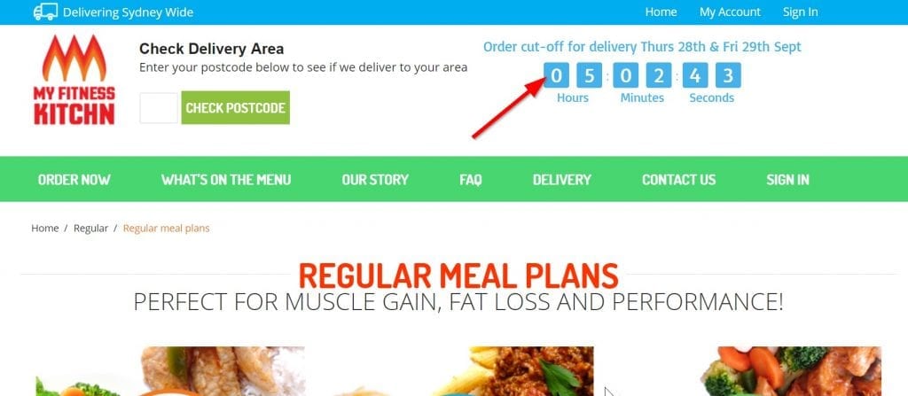
But apart from this, countdown timers are also often used on product pages or landing pages. For example, if you’re running Google or Facebook ads that lead your shopper to a specific landing page within your website, one effective way of getting their buy in is to bait them with a special, once-off offer, plus a countdown timer notifying them that they can only get this offer if they make payment within the next 15 minutes.

Countdown timers can also be used to reduce cart abandonment. For example, once your shopper reaches the checkout page, highlight that the free shipping you’re offering is only valid if your customer checks out within 15 minutes (and throw in the countdown timer there so that your customer can see the time ticking away). This will help you increase your conversion rates significantly!


IMPROVING CONVERSION RATES: A FINAL WORD

Whilst the eCommerce industry is growing, it’s also becoming extremely competitive. In the past, you’d be able to skate by with a decent-looking website and products which are of reasonable quality, but these two elements aren’t enough (not by a long shot!) for eCommerce stores to survive today.

Whilst we’ve listed some of the best practices in eCommerce website design in this article, this is by no means an exhaustive list, and results may also differ from store to store. Instead of taking these tips at face value, be sure to A/B test them for yourself, and measure and track the results, so that you can subsequently fine-tune your efforts. With each tweak that you make, you’re one step closer to increasing your conversion rates, as well as your revenue.

PS: Need some help with re-designing your website? Contact us and we’ll audit your existing site, and provide you with a free, no obligations quote.

Some Australian Small Businesses that have chosen Quikclicks to help increase their online leads and conversions are below: