Optimisation Secrets to Skyrocket Your E-Commerce Conversion Rates

If you own an e-commerce store, then you should always be testing and optimising your conversion rates. From the moment your visitors arrive at the landing page and all the way to the payment confirmation page, you should optimise the flow of each step. The most critical step are probably product pages.

In this article, we’ll focus on improving product page’s conversion rates and usability by implementing best practices for e-commerce. These practices can guide you in improving your conversion rates, but there are no hard and fast rules.

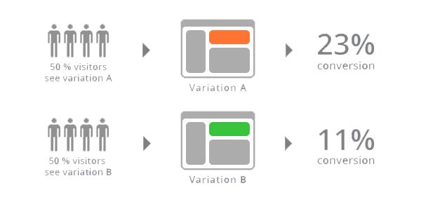
Since every e-commerce store is different, some optimisation techniques that worked for somebody else might not work for you. You can test everything in A/B manner to statistically test if something increased your conversion rate or not. When you run A/B test, make sure to test the new product page against the old one. Don’t just make changes without testing it first to see if it’ll improve the conversion rate because it rarely helps your e-commerce business grow.

Conversion Rate

Product Pages vs. Landing Pages

In e-commerce, a landing page is not just a dedicated page on your website or your store’s homepage. E-commerce websites are different than most other websites where you lead the specific audience to a dedicated landing page to offer them a deal or pitch them something. In e-commerce, almost every page can be a landing page and you should optimise all of your pages so when a shopper arrives, they will get the right message. Some store owners create specialised landing pages because they think they will help them to sell more, but most e-commerce customers don’t respond very well to this kind of landing pages. These pages just get in their way because they have a specific product or purpose in mind. You should make it as easy as possible for your customers to learn about the product and to buy them. You do this by optimising the pages that they are already arriving on, and in most cases, this is your product page.

Instead of thinking of product pages solely as a place to put product information, you’ll have to think of them as sales tools, and should be treated as such. They need to make a great first impression on the potential customer and also convince them to click “add to cart” button.

Since most customers will be arriving first time at your website, product pages are their first introduction to your company and your products. In this case, they are basically selling your store and you should make it easier for them to learn more about it. The messaging you deliver should be the same, no matter where people first arrive in your store. You should quickly explain to them what you are about, who you are and why you are a better choice than your competitors. Some of the ways you could do this in a few ways:

  • Add the same blurb in every product description (e.g. “100% organic”)
  • Add an extra photo that tells your story or provides some history
  • Adding your unique principles and points of difference

People won’t usually click around and read through all your pages to learn more about you, so if you have something important to say about your products or company, you should put it on all your product pages.

What About Homepage?

When they first arrive at your website, customers are developing an impression of you and your products. They can decide in just a few seconds if you can meet their needs or if they should be looking elsewhere. You should customise the homepage experience based on the industry you are in since this will lead to a much better experience for customers.

There’s no way for every store to convince their potential customers to make a purchase by using the same homepage template. The needs of people coming to look for food are vastly different from ones that need to buy some apparel. They have totally different budgets, levels of urgency, and tastes. A good homepage should reflect the needs of your customers and this will make them more likely to buy from you. Let’s take a look at a few quick examples in different industries.

Fashion Stores

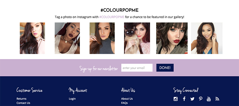
These stores should build a long-term relationship with their customers and turn them into a brand loyalist. You can do this by featuring social proof photos from your users which will show your brand’s legitimacy and also give your customers a feel of how the products look on people. Linking to return and exchange policies is a big one and it helps customers feel better about buying something from your store. A row of new arrivals is something great for repeat customers because they’ll see fresh items and not get tired of seeing the same ones over and over. Overall, you should help customers see how products will look on them.

Fashion Stores

Electronic Stores

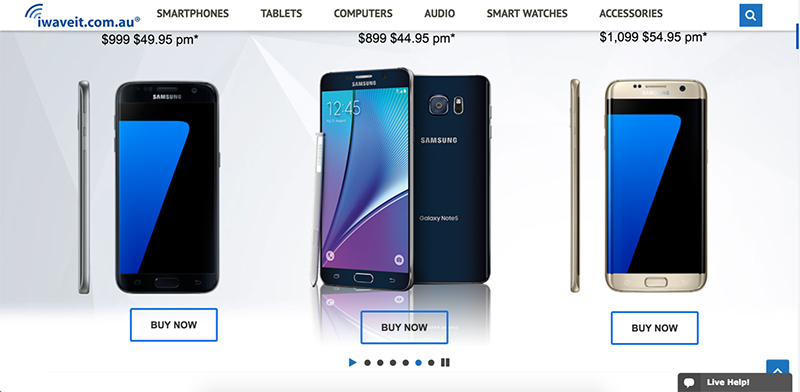
People who want to buy gadgets and the latest tech usually want what’s new and hot. You should highlight the most popular products in your store in a slider if you have one or somewhere else where is visible. Sliders can also be used to show new products and also products that are on sale.

Electronic Stores

Food Or Drink Stores

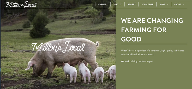
If you are in this niche, then you should sell your customers on your story instead of your claims. You can do this by writing a story about your company – where your products come from, what motivates you, what inspired you to create them, etc. The story should be compelling enough so the people are drawn in and want to learn more.

Use authentic photos from your workplace which will give your customers a sense of who you are. You can even move the text from “about us” page to a homepage.

Food Stores

Feature High-Quality Product Images

Product images have a huge impact on conversion rates in e-commerce simply because people want to see things before they buy them. Since all they can do is look at the product and not hold it or feel it, you must make up for it with great product images in high resolution. Remember, a great image can be worth a thousand words. Avoid stock photos if you can because people ignore them and focus on photos of real people because they get the most attention.

You will notice that when you use large images with multiple angle shots that conversion rate seems to climb up. Here are some things to consider regarding product images:

  • Images must have the same look and feel with consistent image lighting, saturation, and contrast
  • Use clean and consistent background with no clutter
  • Show the context of the product if you can (e.g. someone wearing a necklace)
  • Use multiple angles and alternative views
  • Photos of details (e.g. components, packaging, accessories, etc.)

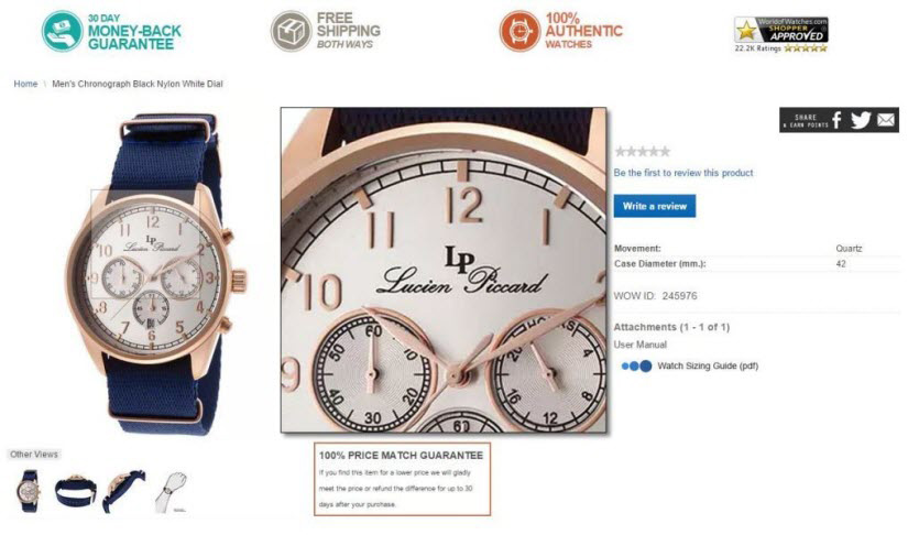
One of the important things is product zoom feature. People like to see the product in detail before they buy it and zoom enables them to do just that. They should be able to see all the details in HD even when they zoom.

Product Images

Customer Submitted Reviews And Social Proof

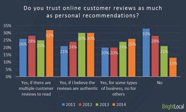
Research has shown that 90% of customers say their decision to buy something or not is influenced by online reviews and all of them trust online reviews as much as a personal recommendation. Also, reports show that customers are twice as likely to buy when they see recommendations from social media.

Poll

If you add the reviews on product pages, then the customer doesn’t need to leave your site and go look for reviews on the internet. Make sure to test adding user submitted reviews on all your product pages because they can increase your revenue overnight.

You can also monitor your social media profiles so you can catch any positive reviews people have left for you. Then, use your landing page to share those reviews! You can also implement some company badges such as Visa and MasterCard logos if you are offering that kind of payment processing or a simple PayPal logo.

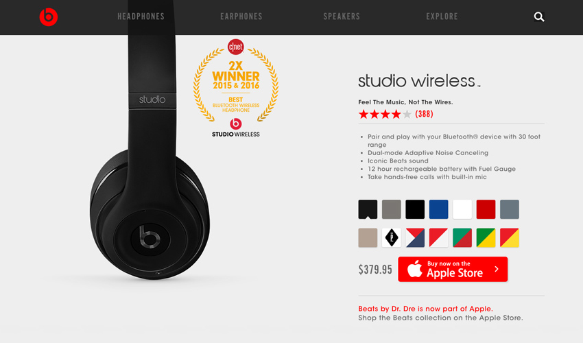
The image below shows some of the social elements you can use:

  • Awards
  • Guarantee seals
  • Customer reviews
  • Product recommendations
  • Security certifications
Social Elements

Related Product Recommendations

This is a great way to increase the average order value and also conversion rates. While this is a great tactic by itself, you can take it a step further by adding personalization to product recommendations. Make sure to A/B test recommendations.

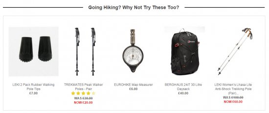
An example would be when someone is checking out hiking equipment, these personalized rule-based recommendations would be shown:

Related

Display Shipping Information

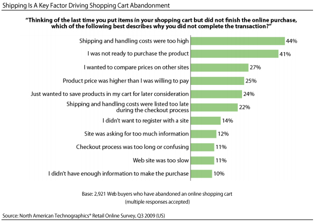
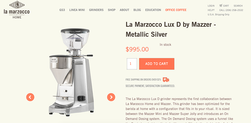
One of the main reasons for cart abandonment is that customers are presented with unexpected costs. Many stores don’t show shipping costs until the person is already checking out. Be sure to display shipping costs on product pages and if you want to increase the conversion rate the most, simply offer free shipping (if possible).

A study has shown that 44% of people abandoned the cart because they thought that shipping costs were too high. If you can’t offer free shipping, then use a flat rate fee or make it free but over a certain threshold like $50.

Shipping

Creating A Flow

When a customer arrives on your product page from a search engine or any type of advertisement, their intent to buy is pretty high because they want or need the product and are just evaluating whether to buy it. The product page should take advantage of this and you should create an unobstructed path between the product and the buy button.

Product Page

You should make sure that “add to cart” button is visible (preferably above the fold) and not too small. The usage of pop-ups after a customer clicks “add to cart” button is something that you should avoid because most people find it very distracting and even if they really like the product, they could simply leave because they got confused or really annoyed. 

Call to action button is one of the most important elements on any landing page and is one of the first things a customer should see and click on. Make it in high contrast and in large enough size so it catches the visitors eye. Repeating your button is a good idea if your product copy is long, so just add it in every section that adds credibility and after product description and customer reviews. 

When someone adds the product to the cart, he (or she) should be taken to a cart immediately or you should make the cart accessible at all times via a cart icon or a link in the top navigation.

Cart

CONCLUSION

You don’t need to create a fancy new landing page if you want to motivate your potential customers to make a purchase. Small improvements on the product pages can boost your conversion rates and sales very well. Keep in mind that it doesn’t mean that a best practice that you’ve seen works for someone else that’ll necessarily work same for you. It always comes down to A/B testing as a sure way to improve your product pages and increase conversion rates. Testing and optimizing product copy and design elements is the best way to gauge success.