

5 Modern Web Design Elements Could Be Doing More Harm to your Site
New doesn’t always mean good; in this case, we’re talking about web design. This article discusses the elements of modern web design that could be driving potential customers away.
With functional web design being a top ranking factor in search engines, it’s easy to get carried away with doing all that you can to make your site ‘pretty’. While there is nothing wrong in making a website appealing to your visitor, it can often backfire due to certain web design elements that, despite being popular among many designers, can actually drive the customer away.
This is why it’s important for your company’s web designer and conversion officer to work together. The web designer is usually in charge of making the site look aesthetically pleasing, and the conversion officer is in charge of ensuring that all elements that drive traffic and conversion are met. Sometimes these two parts are at odds with each other.
For example, sometimes companies make the mistake of including elements that actually don’t do anything for their site. For the sake of being fashionable, they will often say yes to design changes without considering the bigger picture.
New and modern web design trends don’t always mean good. Exciting, yes –but not if it takes a customer more time to wait for your website to load or to look for the button that takes them to the order page.
Just take a look at major e-commerce websites. There’s a reason why they don’t employ too many fancy designs. It’s not because they’re hesitant for change, but when your main goal is to convert a visitor into a purchaser, practicality and functionality often need to trump creativity. Creativity sometimes needs to be held back to be only a part of the formula.
Avoid wasting time and money and reconsider these modern web design trends that could be bringing down your conversion:
1. Animation
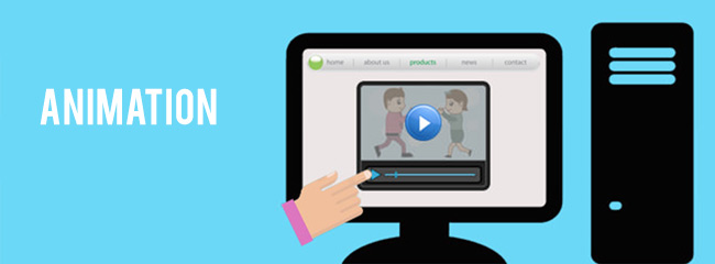
So you want your visitor to watch a really cool animation before settling into your site. Animation certainly adds life and movement to a site but should be used with good purpose, not just for show.
An effective animation is one that catches a user’s attention with relevant information and points them to important areas of the site. A visitor should be able to turn it off if they choose not to watch it.
2. Difficult navigation
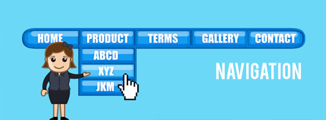
Expect your visitor to be someone who is impatient and busy. Now put yourself in that user’s shoes. How would you expect them to feel when they visit your website, spend a minute only to realise they have to do this and that, and some more before arriving to the page that they’re looking for?
It only takes a few seconds to capture your visitor’s attention. We’re talking about a regular user. One who has access to thousands if not millions of pages of content for potential browsing. There’s only so much the human mind is willing to put up with especially in this era where we increasingly expect to find relevant information in just a few seconds.
Some businesses will certainly want to take the unique and original approach of placing their navigation elsewhere besides the top, but this can often negatively affect the user’s experience. If you insist on going for an original navigation placement, make sure it’s visible for the customer to see and allows them to seamlessly browse the site. Make a visitor squint too hard in confusion and they might just end up looking for the information they need somewhere else.
3. Non-existent or difficult to find call to action

Employing minimal web design is good and becoming quite popular among many. Website loading is faster, there are less distractions, and it is direct to the point. All this becomes useless when the call to action is either absent or difficult to find. Forget heavy graphics and time-consuming animations. Those can all be added for things to consider later but the most basic element of all, the call to action, should never be overlooked.
To create an effective call to action, stress the benefit of the conversion and don’t forget about colour. It shouldn’t blend in with the theme. Make it more prominent by using contrasting colours; this will greatly increase the conversion for your product or service.
4. Page load time
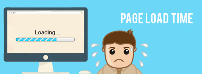
Page load time not only affects conversion but also your SEO ranking. The more time it takes for your site to load, the less likely it is for your site to rank higher in search engines.
Websites have a maximum of 10 seconds for a visitor to find the next step towards what they are looking for, and if that is delayed by one second, it could result in a 7 percent drop in conversion rates. The culprits? Video, widgets, inefficient code, parallax animation, and un-optimised images are just among the major ones.
To help improve your page load time, consider using tools like PageSpeed Insight. This tool will not only determine your page speed core but also provide you with suggestions on what you can do to make your site load faster. Other tools that you can use include OnCrawl, YUI Compressor and YSlow.
5. Imbalanced text to graphic ratio
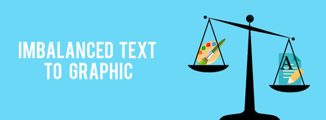
The ratio of your text to your graphics will vary depending on your site’s genre and the feeling you want to evoke from your visitor. While it’s important for your page content to address people’s questions and concerns, it shouldn’t be too long that it drives their attention away from other important factors like the call to action.
Keep your product text concise with optimal impact. The sweet spot for word count is between 300-350 words. Be brutal and only discuss points that strengthen your argument and persuade the reader. Leave out everything else. If you need to include more text, break them up into manageable chunks that’s easy to navigate and is visually interesting.
When it’s Okay to be Ugly, and Not Modern
Ironically, some websites with ugly or bad design do bring in more customers. When a user visits an ugly website, expectations are usually low. But all of that changes when they quickly find the information that they need.
What’s the secret? Value.
Value is the one thing that all highly converting sites –ugly or beautiful— have in common. Just take a look at Craiglist, Wikipedia, or eBay. There is nothing ground breaking about these site’s designs and yet, they invite visitors because of the high value they provide.
This isn’t to say that you should settle for a cheaper designer and just get on with an ugly website. There are certain web design principles that make these ugly websites convert.
They are:
- Distraction-free
- Functional
- Not that important to the user
- Consistent with branding
Take a cue from these ugly websites. You may not need to do a total website redesign after all. If your site is highly functional, doing a redesign might only do more harm to your traffic and profits. Instead, apply the same principles these sites have done with theirs.
There’s nothing wrong with wanting a modern website design as long as you only include elements that are not only visually pleasing but also provide value to the user. The clearer you are with your value proposition, the higher your conversion rate will be. Create more distractions and anxiety and you’re only driving your visitor away.
It should express your brand’s values but not get in the way of functionality and user-friendliness. This is something that will warrant an important discussion between your web designer and conversion officer making sure there is a healthy balance between beauty and functionality.
Did you have any objections to the points we have discussed above? Prove us wrong in the comments.