
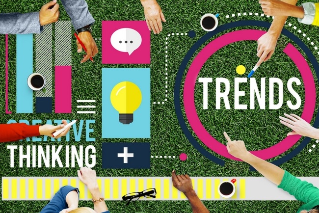
Trends in web design are always changing with new workflows, tools, and best practices, where some trends come and go very quickly. Because of this, it can sometimes be a challenge to keep up with the latest web design trends.
We’re still working on responsive web design, performance & speed, flat design, and we’re making sure that user experience is perfect. This year’s trends are focusing on streamlining and perfecting the user experience.
Let’s take a look at the Top Design Trends of 2017.
1. Cards
Card layouts on websites were popularized a few years back by Pinterest and are a trend for content heavy pages where the most relevant information on a topic is placed into one container that is easily scannable.
Cards are very intuitive and simple to understand and they allow websites to organize a huge amount of content into easily to digest pieces. This layout is very useful for social media sites. Cards are great for responsive design because they can easily reorganize to fit diverse breakpoints.
Here are some of the best practices:
- One concept per card – each card represents only one idea. Don’t put an article and a video link on the same card, even if they are on the same topic.
- Colour blocking – this creates a more compelling visual effect and separates content. Simply assign different colours to different cards.
- Clickable card – make sure that you allow the user to click any part of the card, not just image or the link.
- Masonry vs. grids – making the rows and columns asymmetrical masonry is a way to possibly improve user engagement. Be sure to also test columns and rows of equally sized cards.
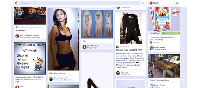 Photo Credit: www.pinterest.com
Pinterest is the champion of card designs which has influenced many industries. Cards allow websites to organise content into digestible pieces, which is especially useful for user generated content and social media.
2. Minimalist Design
By focusing on the content and removing distractions creates a visual aesthetic of minimalism. By incorporating this design, you are also reducing loading times and putting the attention on content. It also creates a beautiful atmosphere of sophistication and makes the page more readable and clear.
Simplicity should be your main goal. Removing the unnecessary elements off the screen, you are putting more emphasis on the remaining elements. This applies to text as well, be as clear and as short as possible with your website copy. Negative space is the main component of minimalism, it’s what makes it easy to read and visually comprehensive.
If you have a vertical layout, is a good rule of thumb to make the top or first few screens minimal, and then further increase the negative space as you scroll down.
Another thing to realize is that asymmetry can work really well as long as you visually balance it. You can achieve this by simply shifting visuals or text to a certain side of the page.
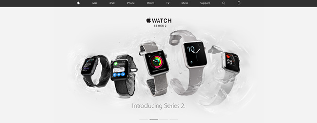
Photo Credit: www.apple.com
The champion of simplicity, Apple’s website reflect there minimalist design products known all over the world.
3. Material and Flat Design Hybrid
This hybrid is known as flat design 2.0, and it combines the Google’s material design, which is a simple layered design language, with flat design.
Some of the benefits of flat design 2.0:
- It has a very modern visual aesthetic
- Improved usability because clickable elements are easier to spot
- Faster loading times
- Realistic mechanics
- Browsing on a desktop feels very fast and effortless due to material’s mobile-centric practice
Material’s animations work really well with flat’s visual simplicity. Motion on the page indicates meaning; so things, like the spinning of the button imply action, and crawling of the menus from the side indicate to a user which direction to swipe if they want to activate them. This can be applied to mobile apps as well as to desktop.
Material design was first intended for apps, but Google later released material Design Lite for websites. You can use any front-end tool of your choice to build the website since Lite comes without a framework and is lightweight with coding.
If you want to create a shortcut for the main action on a page, you can superimpose the floating action button over an area to conserve space.
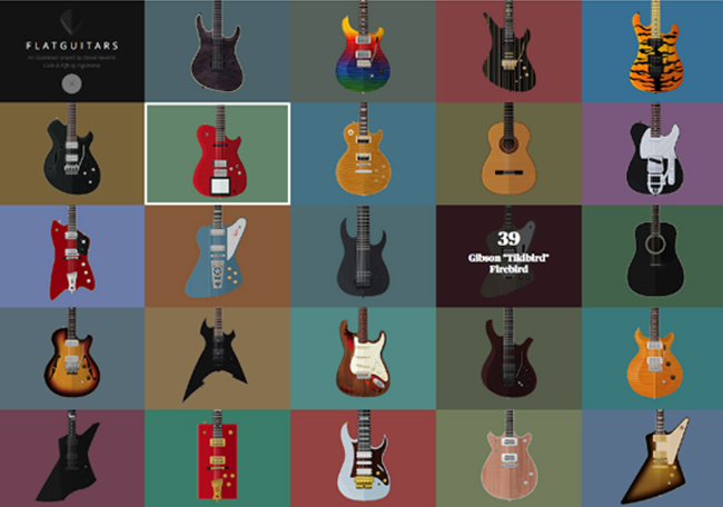
Photo Credit: www.flatguitars.com
This e-commerce website (literally) dedicates its whole brand name and website to the flat aesthetic.
4. Rich Animations
Animations are a good addition on a page and they can range from tiny ones to full-blown animations in the background. Animations create a more engaging experience than if you were to use only static images, plus they provide a smoother visual feedback. With animation, you can also draw user’s attention to specific elements.
Let’s take a look at some of the best practices in regards to animation:
- Enhance long scrolling – You can break up your page into chunks that are scrollable. In the each chunk, simply introduce the content with the animation.
- Navigation – If you are using hidden navigation that is tucked away off the screen on your page, like an animated menu that slides, crawls, or drops down, then the animation creates the impression that the page is a cohesive system.
- Animation for storytelling – You can create a more immersive experience for the user if animated effects modify the screen as the user clicks, scrolls or move the cursor.
- Page loading – If your page needs time to load, then using animation can ease the wait. Try out other creative solutions instead of using a classic percentage load bars.
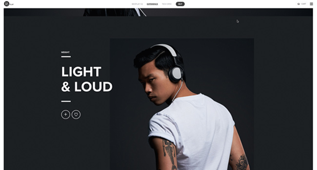
Photo Credit: www.beoplay.com
5. Dramatic Typography
With faster internet speeds, better resolutions on devices and the availability of Google Fonts and Adobe Typekit, this is the time to be using typography.
Typography magnifies the text content and is a convenient way to display brand identity. It is also very useful for call to actions.
Here are the best practices of typography:
- Readability above all – Remember that no typographic style works if you can’t read it properly
- Make it simple, but dramatic – Simple typography is a necessity for minimalist style and is better for loading. Some tips to make it dramatic include increasing typeface size, adding a bold style, and contrasting its colour to the surroundings.
- Overlaid handwriting typefaces – Handwritten typefaces project homemade style. To make the page readable as much as possible, limit its use to only big titles that are overlaid across images.
- Shared/superimposed spaces – If you want to get text noticed then simply superimpose it over other elements. A popular trend is to extend text beyond its section, like having half of the text go over an image.
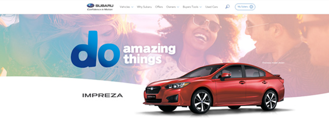
Photo Credit: www.suburu.com.au
Suburu do a great job of minimalist design on the banner with dramatic typography. They convey brand identity, responsive to mobile devices and enhances the text content.
6. Vibrant Colours
Vibrant colours were a trend back in 2016, but in 2017 they are taken to the next level. With vibrant colours, various gradients and hues can help to distinguish content and they are very visually stimulating.
Duotone technique continues to be very popular alongside bright colours. Is a colour scheme consisting of two colours, whether is two shades of one colour, or two totally different colours. Duotone is usually used to represent photography or real images, and this creates a very modern look.
Overlay is a standalone trend, especially over photos. You can use it to enhance the impression of a photograph.
One popular design trend at the moment is blending colours into each other with a gradual fade. Limiting your range between 2 or 3 choices is a good idea.
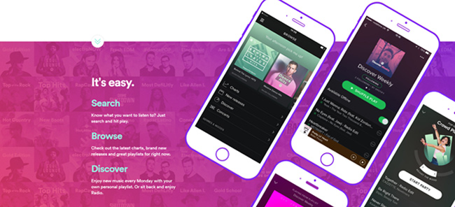
Photo Credit: www.spotify.com
Spotify use different hues and gradients can help distinguish content and is visually stimulating for the user.
7. HD Visuals
Fascinating videos, impressive photography, and rich graphics are what is popular now. High resolution is becoming the standard, and 2016 is definitely a year of HD design, plus users who are browsing on HD devices expect it!
On minimalist websites, you can use full-screen background images that will draw the user in right away. Be sure to crop images and adjust them for devices of various sizes.
If you can’t afford to use custom photography all the time, then combine it with stock photography and make it feel custom. Simply find stock photos that match the subject of your custom photos, or add logo and brand colours to a stock photo.
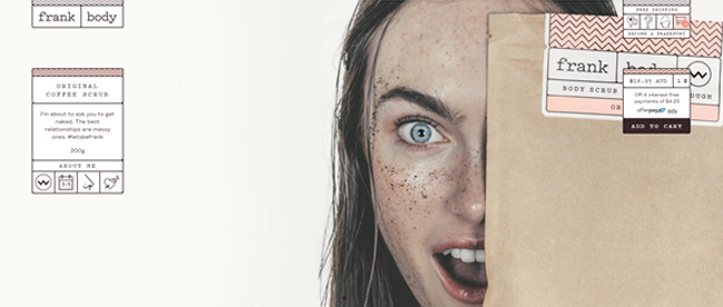
Credit: frankbody.com
Frank Body use engaging high quality visuals throughout their website mixed with brand colours giving it an overall great aesthetic appeal.
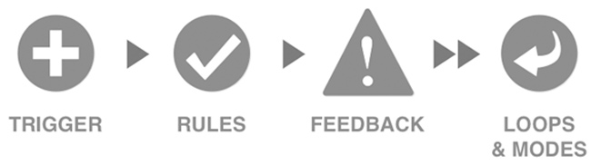
8. Micro interactions
These are the minor interactions that users perform without much thought. Some examples include tapping a button to turn off the alarm, a button that changes colour to indicate that it’s pressed, a sound that notifies you of a new comment or like on your photo etc.
Here are some benefits of the micro interactions:
- They teach users how to interact with a website
- Providing feedback for completed actions
- Informing user of changes, status, and highlighting certain areas
- Reinforcing brand identity


2 Responses to How to Get 10x Conversions with Top Design Trends of 2017